


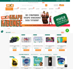


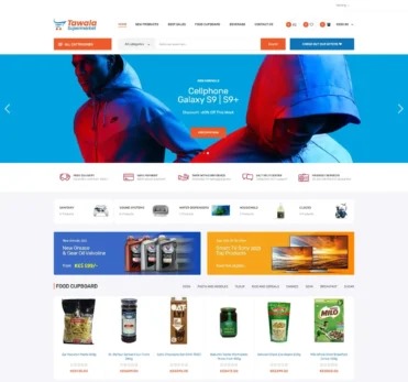


Kenya’s ecommerce space is growing rapidly, with more customers shopping online through platforms like Jumia, Kilimall, SkyGarden, and independent online stores. However, despite the growth, many local ecommerce sites still struggle to deliver smooth and trustworthy user experiences. Poor UX (User Experience) design often leads to abandoned carts, low conversion rates, and frustrated users who never return.
Let’s explore the most common UX mistakes found on Kenyan ecommerce websites — and how you can fix them to create better digital experiences that drive sales.

1. Cluttered Homepages
Many ecommerce sites in Kenya try to show everything at once — from promotions to product categories to pop-ups. This overwhelms visitors and makes navigation confusing.
Fix:
Keep your homepage clean and focused. Highlight key offers, add clear categories, and use white space to make the layout easy to scan. Less clutter improves visual hierarchy and guides customers where you want them to go.

2. Slow Loading Speeds
Slow websites are one of the biggest reasons users abandon online stores. High-resolution images, unoptimized code, and poor hosting can make ecommerce sites painfully slow — especially for users on mobile data.
Fix:
Compress images, enable caching, and host your site on fast servers. Use Google PageSpeed Insights or GTmetrix to test performance. A one-second delay in page load can reduce conversions by up to 7 percent.
3. Poor Mobile Experience
Most Kenyan shoppers access ecommerce sites using smartphones. Yet, many websites are not mobile responsive, leading to distorted layouts and broken buttons.
Fix:
Design mobile-first. Test your site across different screen sizes and devices. Simplify menus, enlarge buttons, and ensure that checkout forms are easy to complete on mobile.

4. Complicated Checkout Process
A lengthy or confusing checkout process is one of the top reasons for cart abandonment. Kenyan shoppers often give up when asked to fill too many fields or create an account before paying.
Fix:
Allow guest checkout, auto-fill address details, and minimize the number of form steps. Offer multiple payment options like M-Pesa, Airtel Money, Visa, and Mastercard.
5. Lack of Trust Signals
Many Kenyan shoppers are still cautious about online purchases. If your site doesn’t look trustworthy, users will hesitate to enter their payment details.
Fix:
Add SSL security (HTTPS), display customer reviews, include clear return policies, and show verified payment icons. Professional visuals and clean design also build credibility.

6. Poor Product Descriptions and Images
Low-quality images or vague descriptions make products look unappealing and unprofessional. This often leads to high return rates and low buyer confidence.
Fix:
Use high-resolution photos from multiple angles. Write detailed descriptions that cover product features, materials, size, and benefits. Use videos or 360-degree views if possible.
7. Weak Search and Filter Functions
When users can’t find what they’re looking for, they leave. Many local ecommerce sites lack effective search bars or filters, especially for large product inventories.
Fix:
Implement a smart search that includes suggestions, spell correction, and filtering options by price, size, color, or category. A good search experience directly boosts conversions.
8. Ignoring Analytics and User Feedback
Some businesses never review how users interact with their website. Without insights, it’s hard to improve UX or fix hidden pain points.
Fix:
Use tools like Google Analytics, Hotjar, or Microsoft Clarity to track behavior. Study where users drop off, and adjust design elements accordingly. Encourage feedback and reviews to understand user frustrations.

9. Overuse of Pop-ups and Ads
Aggressive pop-ups, flashy banners, and auto-playing videos can make users exit immediately. They distract from the buying journey and reduce credibility.
Fix:
Use pop-ups strategically — for discounts or newsletter signups — but only once per session. Avoid covering the main content and ensure easy exit options.
10. Missing or Weak CTAs (Call-To-Actions)
Some ecommerce sites have unclear or hidden CTAs. If users can’t easily find “Buy Now” or “Add to Cart” buttons, they won’t convert.
Fix:
Make CTAs bold, clear, and consistent. Use action-driven language like “Shop Now,” “Get Yours Today,” or “Checkout Securely.” Place them above the fold and repeat them across pages.
How E-Startups Kenya comes in handy
At E-Startups Kenya, we specialize in designing and optimizing ecommerce platforms that deliver smooth, mobile-friendly, and conversion-focused experiences. Our team ensures your website performs at its best, keeping users engaged and satisfied from first click to checkout.
We handle UX design, mobile optimization, speed improvement, and conversion analytics to help Kenyan retailers dominate online.
Conclusion
Your website’s UX can make or break your ecommerce success. By fixing these common mistakes — from cluttered layouts to poor checkout flows — you’ll attract more customers, increase sales, and build trust in your brand.
If you’re ready to improve your ecommerce experience, E-Startups Kenya can help you redesign your site for performance, reliability, and growth.

